An alternative Haskell home page
Note: An LLM was not used in writing this article.
Update 2020-05-24
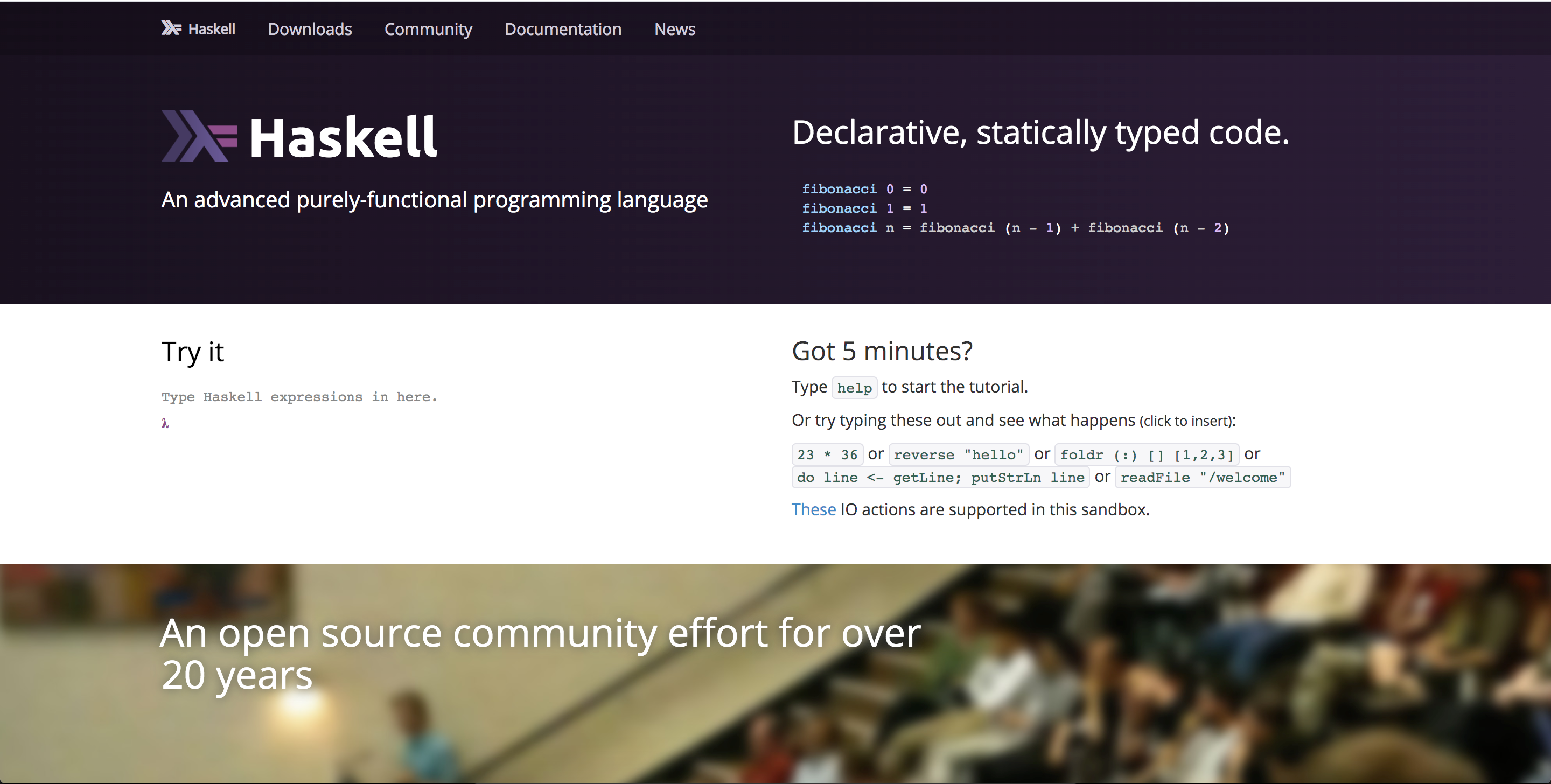
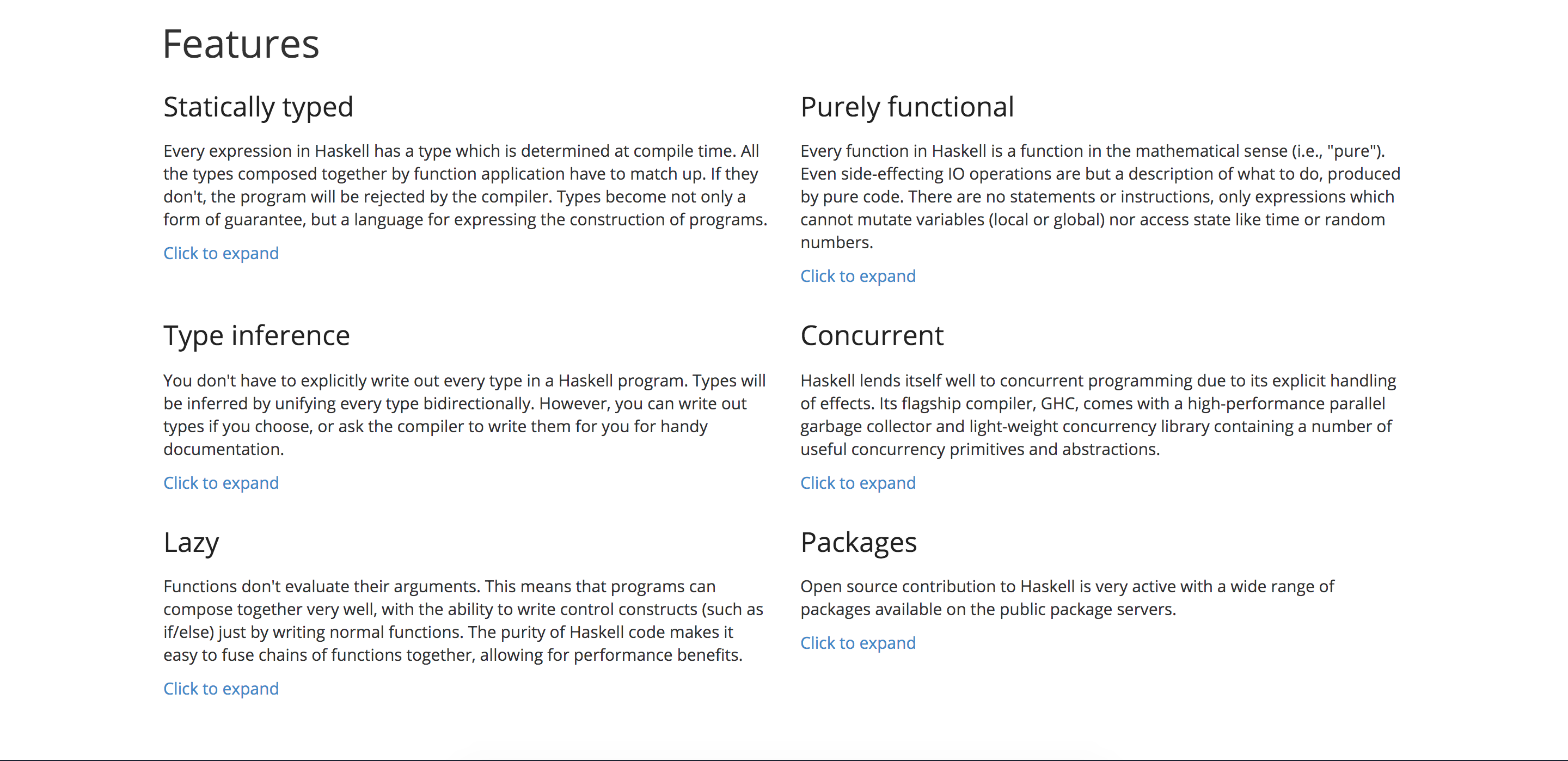
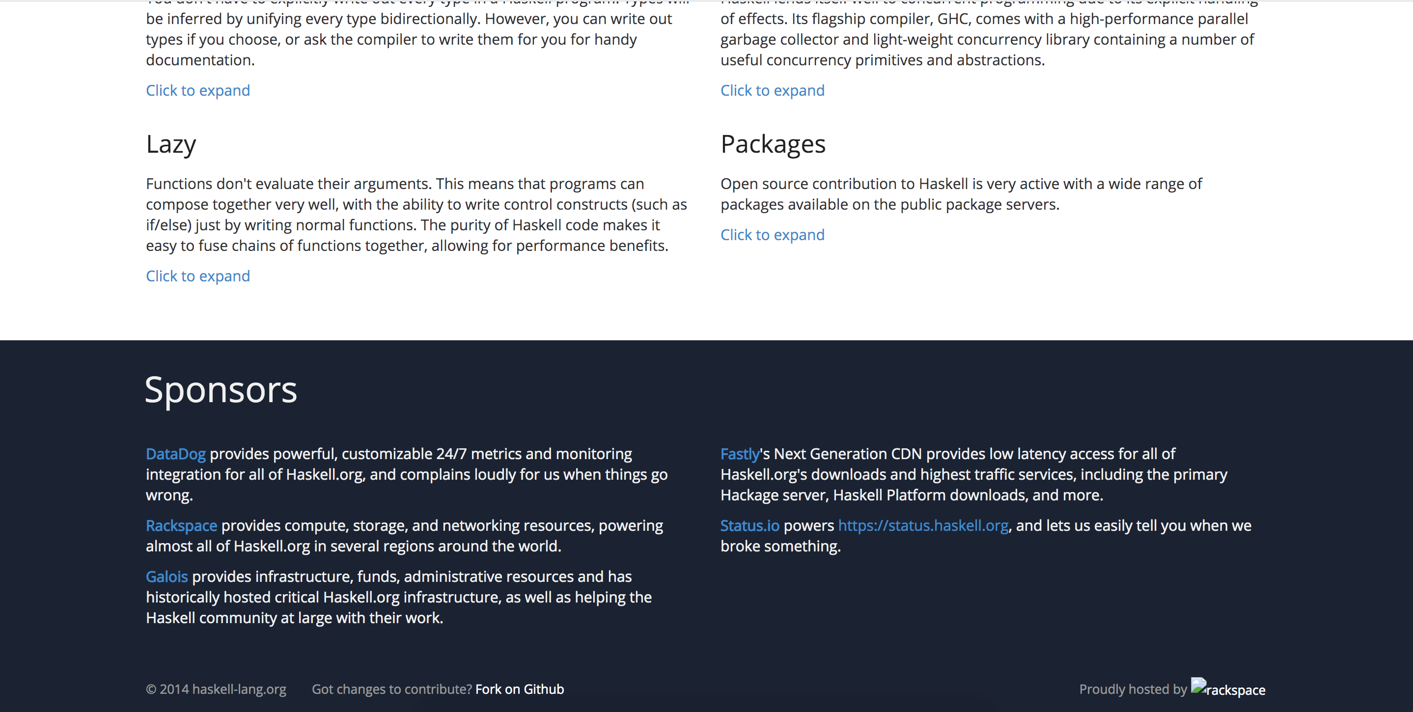
The web site has since been through various iterations and changes, therefore I include some screenshots below for posterity (because my design is much more beautiful than what is now online ;-).


An alternative Haskell home page
I started a couple months back an alternative home page for Haskell. It is a work in progress, but as I work on it every so often I push changes to it.
What’s wrong with haskell.org?
haskell.org isn’t doing a satisfactory job for me as a place to impress people with Haskell and to guide them into using it.
- Its design is broken or just strangely put together and it’s not responsive.1
- There are too many links on one page which indicates indecision about priorities and a lack of user story or particular target audience. Who’s this site targeting? Where are they supposed to go next? Is it answering the right questions?
- Also, the uncoordinated effort of the wiki misleads people and pages begin to bitrot. There are too many to vet.
Why not fix haskell.org?
The current home page is historically resistant to change, technologically and socially. My relationship to haskell.org over the years has been one of stonewalling when requesting access, of slow replies, and of bike-shedding and nitpicking when proposing designs. A camel is a horse designed by committee and haskell.org is such a horse.
So your plan is?
The plan goes like this:
- The first part of the plan was to survey existing programming language web sites.
- Decide on an audience.
- Decide on a theme.
- Decide on user stories.
- Implement.
- Yay, shiny web site.
What do all language sites have and what should they all have?
I looked at the following web sites:
- http://fsharp.org/
- http://ruby-lang.org/
- https://www.python.org/
- http://www.rust-lang.org/
- http://ocaml.org/
- http://golang.org/
- http://www.perl.org/
- http://scala-lang.org/
- http://clojure.org/
There are good points and bad points for each one, but I came up with a set of things that are common among all, and a couple additional points I came up with:
- A theme
- Logo
- Menu
- Download
- Community
- Documentation
- News
- Visual things
- Opening paragraph
- Code sample
- Thumbnails of videos
- Pictures of community stuff; human beings
- Screenshots
- Selling points
- News
- Twitter/feeds
- Supporters / sponsoring companies
- Other links
- Application areas / success stories
- Language options (locale; Japanese, German, etc.)
Existing crop of language home pages
If you’re interested in my review of each home page, here’s what I wrote:
- F#’s is boring, it has no character, features no code samples. But it does have a bunch of company backing logos.
- Ruby’s is among the best. It has character. It has two navigations, which is bad,2 but otherwise it’s perfect. Otherwise, my only criticism is that it overemphasizes news which most new people don’t care about and which Rubyists get via other sources.
- Python’s, like Ruby’s, is good. It has character. It has code samples. But it’s worse than Ruby in that it has four areas of navigation. The top bar, the second bar, the third call to action section, and finally the footer. Each of which has a different subset of total places of interest. Again, it uses space presenting news items. However, I particularly like the section which shows Web Programming, GUI Development, etc. and then next to each the library one would use to accomplish that task. That’s very practical and speaks positively about the language and community.
- OCaml’s is not bad either. It has a deserty theme giving it its own character. It suffers from link overload, which implies it might’ve been copying Haskell’s or Python’s home pages.
- Go’s home page is notable for its embedded try feature, something which I’ve wanted Haskell’s home page to have for a long time. It’s also got a very simple and straight-forward navigation. The logo/mascot is in there, giving the whole page a bit of fun character, too. While not much to look at, unresponsive to device, clearly written by a pragmatist systems person, it has a lot going for it and is in my mind among the best I’ve looked at.
- For Perl’s homepage, I’ll echo similar complaints as before. Link overload. It’s a rather lazy way to make a home page. Let’s throw in as many links as we can and hope people read it all and by chance find what they’re looking for. Oh and to fill out the page, let’s add recent uploads (who cares?) and news items (again, who cares?). Finally, it has no character whatsoever. It has the awful O’Reilly pen drawing of a random animal that’s supposed to embody the character of the language, but is meaningless. I probably dislike this one the most, a close tie with F#’s.
- Scala’s is very trendy and pretty. It’s got a lot of events and training info which, along with the header mountains, gives it a very communal and active fresh feel. Again, echoing the praise of Go’s page, it has very simple navigation. One navigation at the top, and then two big buttons for the most common tasks. After that, like Python’s home page, there’s a good review of features of the language that make this language more interesting than the next language. I give credit to this page for visual inspiration.
- Clojure suffers a little bit from linkitis, too. It has three menus and then a page full of links. It has zero code samples on the first page you land on. But it is clean and has a certain character to it.
Generally, I’m not sure why sites bother with search boxes. Unless they’re implementing code-aware searches, Google will be faster and more accurate every time. As Joel Spolsky says of his StackOverflow, Google is the user interface to SO.
Regarding linkitis, I will quote Don’t Make Me Think that a user will happily click three links to narrow down what they want, than to have to think and search around a page to find what they want, if they have the patience for it.
The audience
The audience is newbies. People who use Haskell don’t go to haskell.org. They go to Hackage, or they google search and find wiki entries, or the GHC manual. A home page shouldn’t cater to Haskellers, it should cater to would-be Haskellers.
Naysayers for an attractive home page say things like “we don’t want superficial people joining the community” (as if they could just learn Haskell on a whim!), but forget that people live insular lives. There are millions of people out there who’ve never heard of Haskell. If a random web user stumbles upon it and is taken by the look of it, what are they going to do with it? Share it. How did you first hear of Haskell? I was told about it by a friend.
To decide on the kinds of things I want to see on a landing page when I first look at a language I’m unfamiliar with I ask a bunch of common questions. I’ve condensed them all in the user stories section.
The theme
I’ve always liked the purple and green of the old Haskell logo. I don’t know why gray/sky blue ended up being used for the new logo. So I decided I’d keep that purple theme and made some mockups. Purple is a cool color.
User stories
The user stories I’ve identified have been encoded in the main navigation:
- A user just wants to try Haskell. They scroll to ‘Try it’ and, well, try it. There can be links to further sites like Try Haskell, School of Haskell, Code Pad, Lambdabot, services like that.
- A user wants to download Haskell. They click ‘Downloads’. What particular file they want to download doesn’t matter. It could be GHC, it could be the Haskell Platform, it could be some packages. If they want to download something, they go to Downloads.
- A user wants to interact with/find community. They click ‘Community’. On that page is a list of various community places of interest, which may itself be expanded with videos and things like that.
- A user wants to get information. They click ‘Documentation’. That means books, reports, papers, tutorials.
- A user wants to catch up with what’s new in general, with Haskell. They click ‘News’ and there can be an RSS feed available on that page. Haskell News is mostly suitable to this task.
Ahoy, ye olde mockup!
I synthesized all this together into a comp in Inkscape.
I think it answers the following questions:
- Any particular brand/logo? [header]
- In a few words, what is this thing? [header]
- What does it look like? I want to see code immediately. [header]
- Can I try it right now? [try haskell section]
- I’m still interested. Is anyone using this thing? [community & videos, events section]
- What are the selling points, over, say, ML or C#? [features section]
- Where do I download stuff/find community/docs/news? [the main menu at the top]
I made a mockup for the subsite, but that’s uninteresting.
Implementation
I’ve implemented a starting prototype here at haskell-lang.org. At the time of writing it doesn’t yet fully flesh out all the things planned in the mockup.
There are a few half-done pages in the navigation, fleshed out just enough to satisfy my plan and to motivate for further work.
Here’s a quick comparison of the two sites now:
To illustrate, here’re the sites on various devices:
I’ve also made a little page to render wiki pages from haskell.org.
There is a simple request sent to haskell.org for /wiki/*
pages, it parses the Wiki syntax with pandoc and renders it to HTML, at
least for the pages that MediaWiki is kind enough to serve. Example: Handling
errors in Haskell
Here is the above wiki page with a cleaned up presentation.
Note that MediaWiki is a bit stunted in the data it exposes for use. Some pages just aren’t available, others produce invalid XML, etc. This is why the wiki is not exposed in the navigation.
I’m not sure about exposing the wiki directly, but rather some selected vetted pages, perhaps.
Going forward
I still have to:
Fill in the Try supportThe features copy- Examples for each of said features
A list of video thumbnails to appear under the community banner (as in the comp)- Upcoming/past events
- At least 5 examples for the header code
Add books & manuals to the Documentation tab
I’m happy with the look and feel and organization. Now is the matter of filling it with useful things. That’ll take about a month, by weekend/spare-time development. Once that’s done, it will be ready to link to newbies. I’ll have a link to be proud of when people bring up Haskell.
I could solicit the community for contributions via pull requests. It depends on people approving of the project and my approach. So if you’re reading this and you accept my design and organization3 and would like to contribute content (content pages are written in markdown), then pull requests to the github repo would be most handy. I will merge your changes and redeploy with relative speed.
In particular, content in wanting which is not straight-forward for me to produce:
- About 5 examples of concise, short Haskell code which can sit in the header. Ideally, each example can be clicked and it will take you to a markdown page under an Examples hierarchy that explains how the code works.
- The features section needs to be filled out with content. I’m not entirely sure that the headers are decent, but I’m pretty sure they’re a good start.4 Pages for each of those which contain example code of real problems that are solved are needed.
I won’t be able to actively work on this for a few days, but I can do bits and bobs here and there on the weekend and I always have time to merge straight-forward changes.
Questions/comments, feel free to email me: blog@chrisdone.com Put a note in the email if you wish to be CC’d with other people in the discussion.
When I open haskell.org on my phone, I see the tablet-sized layout with tiny text. The layout goes wonky on the tablet version.↩︎
Having two navigations leads to arbitrary choice.↩︎
That means that you won’t nitpick design decisions, bike shed about the theme, organization, choice of picture in the landing page, etc.↩︎
Maybe type-classes and monads might be of interest because both where pioneered by Haskell and, at least in their native support, are both peculiar to Haskell.↩︎